Episode Transcript
[00:00:00] Speaker A: Foreign.
[00:00:09] Speaker B: Welcome to the Clear Impact Podcast, brought to you by Mitre Brands University. Thanks for joining us today. My name is Sheri Conner and I am your host.
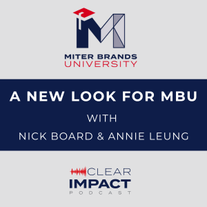
So, good morning. We are here on the Clear Impact Podcast and we are so excited about the things that are happening with our team. With the acquisition of PGT Innovations last year by Mitre Brands, we've had a lot of changes and our team has not escaped that. We have a much broader scope now of responsibilities, which is for the entire enterprise. So that includes MI Windows and Doors and Milgard Windows and Doors. And this is really exciting for us as we tackle some broader markets and new product lines. And. And so with that, we were really ready for a fresh start. So we have a new name. We are now Mitre Brands University, which is so exciting for us. This means a new webpage and a new logo.
And fortunately, we have an amazing marketing team here, and they went right to work and developed a new logo for us. And so we wanted to kind of shed some light on the ideas behind that image and kind of walk through what that process was.
So joining me today in studio is Nick Bord, Marketing Manager for the east, and Annie Leung, our senior Graphic Designer, who's joining us on the phone. So welcome to you both.
[00:01:38] Speaker C: Yeah, thanks for having us.
[00:01:40] Speaker A: Hi. Thank you.
[00:01:41] Speaker B: Yeah, I appreciate your time to record with me today. Nick literally just got off a plane flew in this morning, so we're excited to be able to record.
So we'll just start with some basic introductions. So, Annie, tell us a little bit about you, your career path, your experience, and what you your current role is for mitrebrand.
[00:01:59] Speaker A: Hi, this is Annie Leung. I'm the Senior Graphic Designer at Miter Brand in the marketing creative team. I have a BS in Graphic Design, an MA in Visual Communication, and recently an MBA. I have been in the design industry for over 25 years, so I would claim myself as a lifelong creative problem solver.
[00:02:23] Speaker B: I like that. That's a fun title. We're lucky to have somebody with that kind of experience and education.
Nick, this is your first time on the podcast. Tell us a little bit about you.
[00:02:31] Speaker C: Yeah. And one, I just learned that Annie's a collector of degrees. I had no idea that she had that background, so that's super awesome.
So my name's Nick Bord. I am the Marketing manager of the east for Mitre Brands, and so that includes all of the brands east of the Rockies. But I also support Mitre Brands as the parent company as a whole. And with that, I also have a PR and comms team. That is a part of my team. I've been with Mitre Brands for almost four years now, and it was a big shift in industry for me, but I found a happy home here and have been very thankful for the experience at Mitre Brands. One of the awesome things for me is I work out of the Detroit area.
[00:03:14] Speaker B: Okay.
[00:03:14] Speaker C: And we have a plant about 45 minutes away from me in Temperance. So along with traveling around, I visit our team down in Temperance quite a bit too.
[00:03:22] Speaker B: Nice. I was just going to ask, like, where are you housed? So. In Detroit.
[00:03:26] Speaker C: Detroit, yeah. I'm about 15 minutes north of the city.
[00:03:28] Speaker B: Okay. I got stuck in a Detroit airport once. That was not a fun time. We won't talk about that though.
[00:03:33] Speaker C: I usually get stuck down in airports in Florida, so I think we're even.
[00:03:37] Speaker B: Yeah, probably true. So, Annie, you're on the phone with us. Where are you calling in from?
[00:03:42] Speaker A: I'm calling from Weston Window Systems, which is located in Phoenix, Arizona. I have been working at Weston Window System for the past seven years and and now very happy to join the Maida Brands family.
[00:03:56] Speaker B: Awesome. Well, I am thrilled that you could both be with us today. Let's talk about the logo. So, Annie, when it came to creating a new look for our team, what was your process on this?
[00:04:06] Speaker A: So, for me, the most critical steps in any project is the initial meetings. This is where I can get the most, like, the clear understanding of what my client's expectation is.
This conversation, like this initial meetings lays a foundation in how I can translate the vision into visual communication. I have an old school approach and I always like to start with pencil sketches. And I think it is the simplest and the most effective way to find out what the client want from early on. Because once the direction and the concept is clear, the layout and the design just fall into place naturally. And one thing I truly believe is that if you can make a logo in Word Dog, it is not a real logo.
[00:04:55] Speaker B: I would agree with that.
[00:04:56] Speaker A: So a strong professional logo takes time to craft. It has strategy, design thinking, and refinement behind it. And trust me, you can tell the difference.
[00:05:07] Speaker B: Oh, yeah, no, for sure. And so, Nick, tell us a little bit about that. Like, you were part of this process as the leader kind of overseeing the general rebranding for us. What is part of your process?
[00:05:19] Speaker C: Yeah, I think this was a really exciting project and really was kind of a culmination of a year's worth of effort of figuring out how all of the different resources within PGT Innovations fit and how they fit into Mitre brands and what we call them and what that strategy for the whole enterprise was like. So we did a lot of work leading up to it, trying to understand all of the capabilities of the university team and how that could translate across the business. And for me, as a passionate communicator, where Amy is a visual storyteller, really took some of the time to understand that the university is peeling back the finished product and showing from the insides out of how everything comes together and why our products are the industry leading products. And working in this process with Amy and the team, we wanted to make sure that story gets captured in a visual way as well as in the boilerplate and other resources that the marketing team wraps around. But it all starts with that visual identity that Annie knocked out and what feels like record time for me.
[00:06:29] Speaker B: Yeah, we were waiting forever, it felt like, but I know it was pretty fast. So we had an initial meeting that our team was presented with a couple of options and then we, we kind of tweaked it and honed it and you guys took that rough idea, which led to a second round of feedback. So, Annie, was it hard to have your ideas picked apart like that or tell us a little bit about what that feedback process is like as a creative problem solver?
[00:06:55] Speaker A: I love you guys to pick on my idea because one of the most valuable lesson I've learned in my design career is never take the feedback personally. Growth never happen without challenges. And in design, feedback is everything because design is all about communication. So without that, it's just simply a piece of art.
[00:07:20] Speaker B: That's true.
[00:07:21] Speaker C: Yeah. I will say too, in the 12 years of experience that I've had in this field working with Amy and her revisions, it felt like she took it as a challenge to get it right for us. And it wasn't just, here's what I came up with. Take a look. It was Amy pressing us, asking us about the angle of lines or the width of it. Like, she was very specific and intentional on why she did certain things there and was able to really pull that out of us to see if we understood that, which was, I think, a cool part of the process that was somewhat unexpected.
[00:07:54] Speaker A: Oh, thank you.
[00:07:58] Speaker B: We are sharing our expertise around all topics relating to the window and door industry. Whether you, you are a customer selling our products or a homeowner doing research, the Clear Impact podcast provides helpful content that makes an impact. Subscribe today wherever you listen to podcasts.
Yeah. So overall, how are you feeling about the final result?
[00:08:19] Speaker A: Of course, I love it. It Is one of the best logo I've ever created. I really enjoy the collaborative process too, because working with the team, that they were able to give honest feedback is the key for the success. So let's dig into the design. Right. So from the overall struct of the M, right, we have explored everything, right? Like remember, Shelly, at first we have connecting lines with the dots and then start experimenting with the different shading. And finally we decided to simplify everything. No dot, no extra lines, and come out with this clean, modern design that is still conveyed the same idea. And then there's more. Right on the model board. We explore whether or not we're going to have it square, have it rounded. What is the white negative space that connected with the M? The structure of the M, all of those details is taken into consideration.
And more if I should continue.
If you see the thickness of the tassel, where it start and where it end, if you look into it, the width of the tassel is one fifth of the overall horizontal width of the M. And also the width of the tassel is the same. Same as the edge on its left, the space in between.
[00:09:37] Speaker B: Oh, yeah.
[00:09:38] Speaker A: And also we explore many options with having a dot on top of the tassel. If we going to have a more narrow tassel, different length, everything, all the details, that's what it mold the entire design together.
[00:09:53] Speaker B: We love it. We're very happy. I didn't necessarily recognize all of those minute details, but I'm not a designer, so it would make sense that it would escape me.
[00:10:02] Speaker A: And also, like, you know, the font selection, the weight and the size, that's how it marked the priority. Right. The minor brands is the focus. The word university comes second. And also there's at least five different weights in the Mitre font family. So it's really critical to select the perfect combination.
[00:10:24] Speaker B: Yes. Well, we are thrilled. Nick, how are you feeling about it?
[00:10:27] Speaker C: Yeah, I'm excited to see the logo start shown up more places. I think I've got a surprise coming for the team to get some of the logos out there. But as we are rebranding the facilities and just seeing it come to life, especially from the sketches that Annie had to getting it installed in the facilities and out to the world is an exciting step. And Annie, I didn't forget about you with that surprise too.
[00:10:54] Speaker A: Oh, what kind of surprise?
[00:10:57] Speaker B: I know, right? It's not even Christmas. This is amazing.
[00:11:01] Speaker C: Hopefully it comes before July.
Won't be Christmas anymore.
[00:11:04] Speaker A: Yeah, nice. There's more.
[00:11:07] Speaker B: Okay.
[00:11:07] Speaker A: I want to also mention the color selecting the Color is something very interesting because we need it to be on brand. We need it to be sophisticated but not overpowering.
So that's why we use the blue as our primary color along with its shades, and also use the red to emphasize the key graphic element and where we want it to pop.
[00:11:29] Speaker C: Yeah, I was going to say, Amy, in our brand, the red is a very strong color. We've tried to take ownership of it, calling it Miter Red, and there's not many uses where we see this blue come out. And so I think the university is kind of unique in that color choice as the secondary color for the brand standards.
[00:11:48] Speaker A: That's one of the really important feedback I got from the team, because if I'm just designing on my own, I would not know all those key details that make it work better.
[00:11:59] Speaker C: I also feel like Annie, we probably should give a shot shout out to Nikki on this project too. Yeah, well, she wasn't the lead designer on it. Nikki leads our creative team and she provided some really valuable feedback and I think thought starters in this process. And so I want to give Nikki a shout out.
[00:12:16] Speaker A: So during the design process, initially, I have the motherboard taking the entire left side of the M, and it's not working.
So with Nikki Domalis help, my creative manager, we go through many design discussion along in this project, and she helped me to take it back a step and to approach the element differently. So instead of just having the entire motherboard on the left side, she and I go through this design. And then we figured out, she helped me to see it. Let's put it on top of the M, make it smaller, but turn it in red.
[00:12:56] Speaker B: So the mortar board has been part of our logo so far in the years that we've been the university.
So it was important for our team to keep that. You know, we didn't really want to lean towards books because so much of our teaching is in person or digital, so we don't really rely on books. But the mortar board does signify that education component. So we were really happy that you could include that in the M of the logo. I think that really kind of makes it more cohesive to the fact that it is an education piece of Mitre brands.
[00:13:27] Speaker A: So all those little details, I thank her for guiding me through.
[00:13:31] Speaker B: Yeah, she has such a great energy. I love anytime I get to work with Nikki, and really loved just how excited everyone was when we had the calls. I mean, they were short, too. I was like, 30 minutes. We have 30 minutes for six people to talk about this logo. How Are we going to do that? And it was just amazing to watch everyone really cooperate and give their opinion and just to receive everything so positively. So, Nick, I have a question for you. So is this something that most companies can do in house or is this something that mostly people rely on agencies for?
[00:14:06] Speaker C: I think a little bit of both, really, depending on the size of your organization.
I think with the acquisition of PGTI into Mitre Brands, our creative service team and marketing team expanded for the better and we got some really amazing talent that allows us to do some of this on our own, which speeds up the process. I think we've relied heavily on agencies in the past for more external facing things and our team would typically take on something internal. But because this is very customer facing, it's out there. It's for the industry to really showcase our team's talent. To make this happen, I think is a value add that not every organization gets to say that they have as part of their marketing team.
[00:14:55] Speaker B: Yeah, I think it was pretty cool that we were able to do this in house. So, Annie, is this kind of work enjoyable for you? Like here, Annie, make a new logo. Like, do you cringe or do you jump up and down? Like, how do you feel about it?
[00:15:08] Speaker A: Definitely jump up and down.
[00:15:09] Speaker B: Okay.
[00:15:10] Speaker A: Especially like, again, it's a creative problem solving. It's my passion to solve your problem in a creative way. Turning a complex idea into like, you know, awesome visual, that's very satisfying, especially when the audience, like when my clients love it. So even more for me.
[00:15:29] Speaker B: Nice. Nick, what do you think our logo communicates to our customers?
[00:15:33] Speaker C: One, I think the previous university logo had more emphasis on the brand and not for the university and what it was supporting. And with the structured M with the mortar board very prominent and larger than the word Mark four Miter brands in there, I think it really emphasizes the place the university has for the business and it really elevates it. It gives it its own identity. It's connected, but it's its own identity that's recognizable.
And I think that's somewhat a testament of what the university team has done and continues to do. As we've been working on the boilerplate, there's been some back and forth with my team trying to figure out how to word it right. And at Mitre, we like to say confident in our abilities and humble in our approach. And there is a little bit of humble brag that we're trying to work in because it's unlike anything else that our industry peers are doing. And so to have something so prominent, unique and distinguished. I think that logo is very fitting and deserving for the team and the organization it represents.
[00:16:43] Speaker B: Well, thank you. We are grateful to have the recognition and the support. And now this fancy new logo that. It's just cool. We're very excited about it. And so for our listeners, check out our new site. We have a Facebook page. We're on LinkedIn. We post a couple times a week at least, with up and coming events and webinars and in persons and YouTube videos and new podcasts and all the things that we're doing. And so, Nick and Annie, thank you again so much for helping our team to refresh the look and for the support for our team and what we do to help our customers know what they're doing. Right?
[00:17:20] Speaker C: Yeah, absolutely. And I think now that Sheri just gave you the link to go look at the logo, go pull it up, and then start the podcast all over again, because it will make a whole lot more sense instead of us just talking about lines and dots and circles and squares.
[00:17:36] Speaker A: Definitely.
[00:17:36] Speaker B: And mortar boards and colors and all of that. Exactly.
So I really appreciate your time today. Thank you both for squaring up some calendar space for us. And we look forward to connecting again.
[00:17:47] Speaker C: Thank you.
[00:17:47] Speaker A: Thank you very much.
[00:17:48] Speaker B: All right, have a good day.
The Clear Impact podcast is brought to you by Mitre Brands University. We are a part of Mitre Brands, a family of leading window and door brands united by our passion for quality and relentless pursuit of 100%. At Mitre Brands, our common purpose is to deliver value by manufacturing the finest products, services and customer experience every day, everywhere. Our window and door brands deliver regionalized expertise, products and services, all backed by a national company.
Mitre Brands University is here to educate you, our listener, so that you can be a more informed consumer consumer of window and door products.